Monsoon Malabar
An identity that contrasts structure with flexibility through the use of the grid and color harmonies
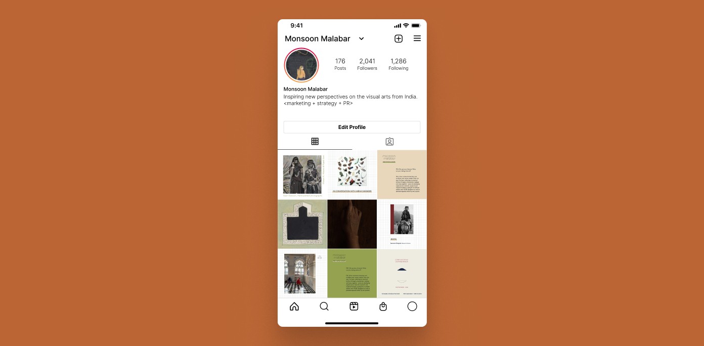
The brand style guide for Monsoon Malabar was created to support the consultancy’s mission of making Indian arts and culture more inclusive and accessible.
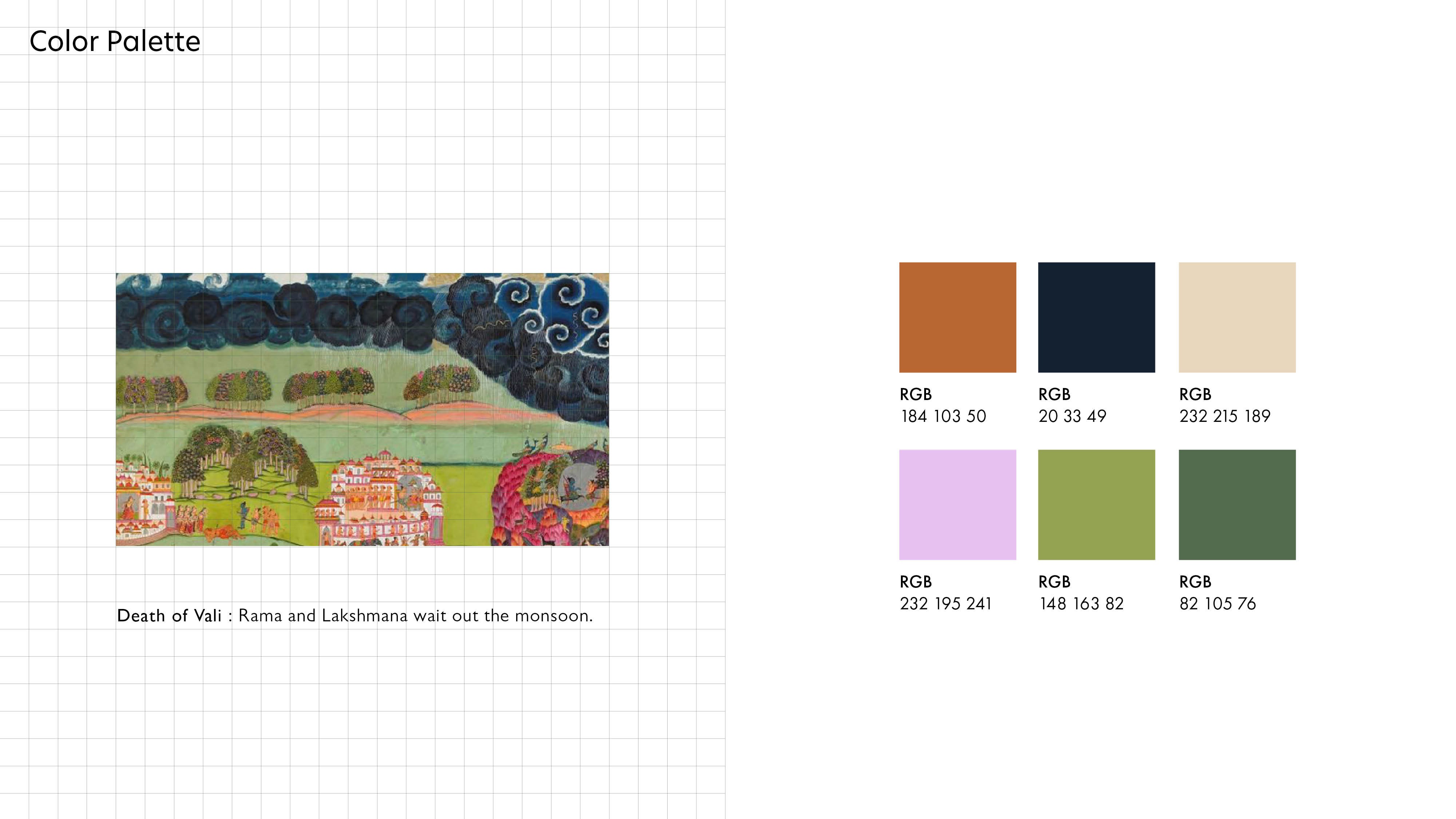
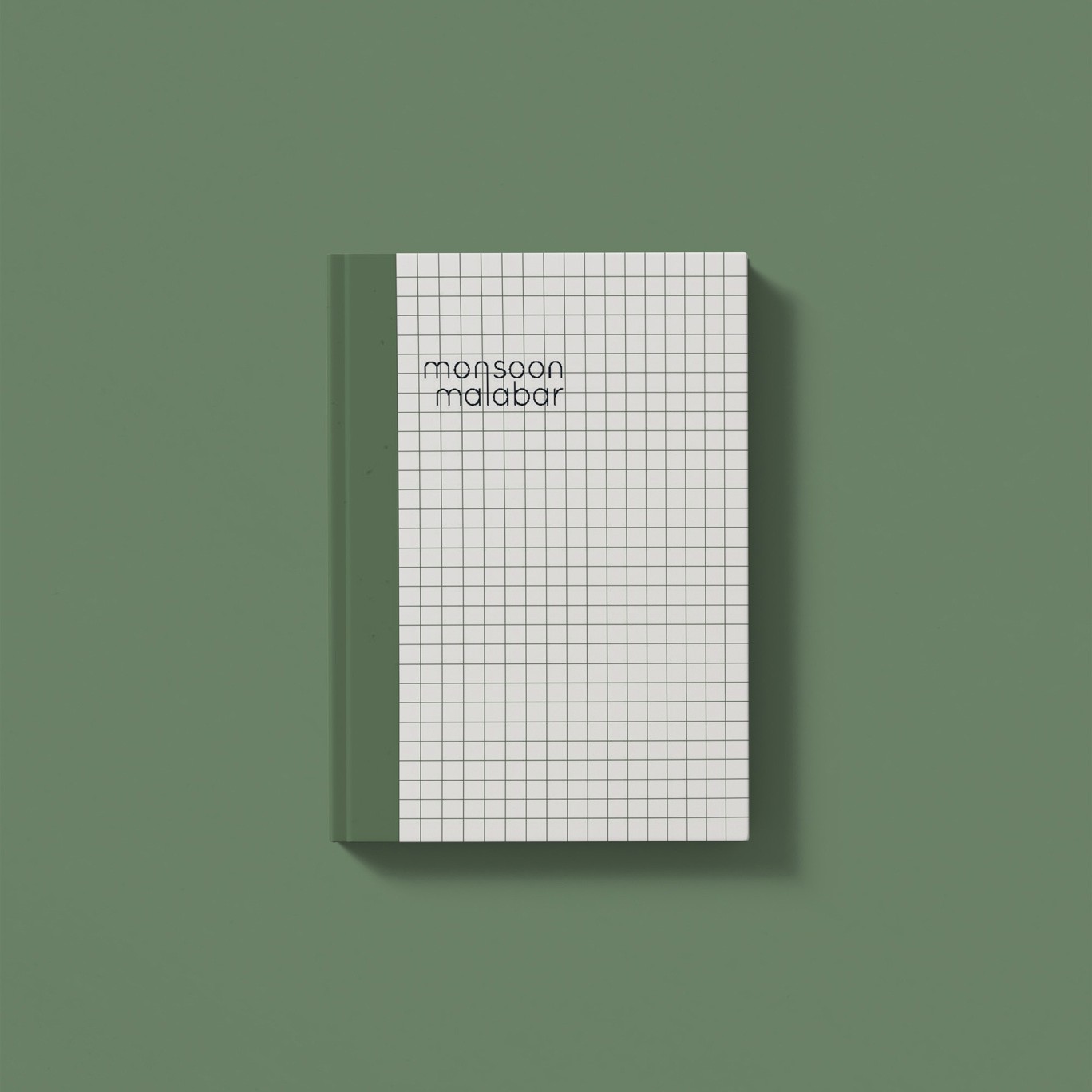
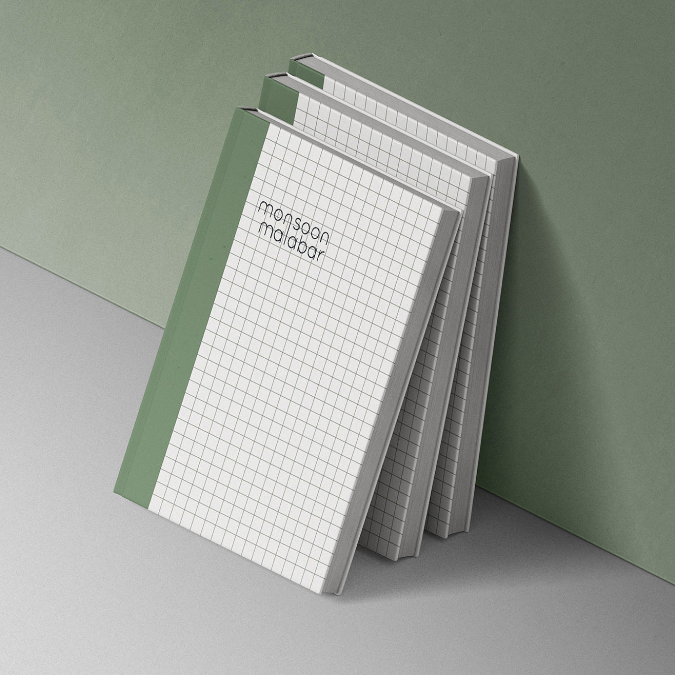
I referenced the consultancy’s favorite miniature painting, Death of Vali: Rama and Lakshmana Wait Out the Monsoon, as the basis for my work. The use of grids in miniature paintings provides a structure, guiding the composition. This approach is mirrored in the design, where the grid anchors the layout, allowing for dynamic interactions with color.
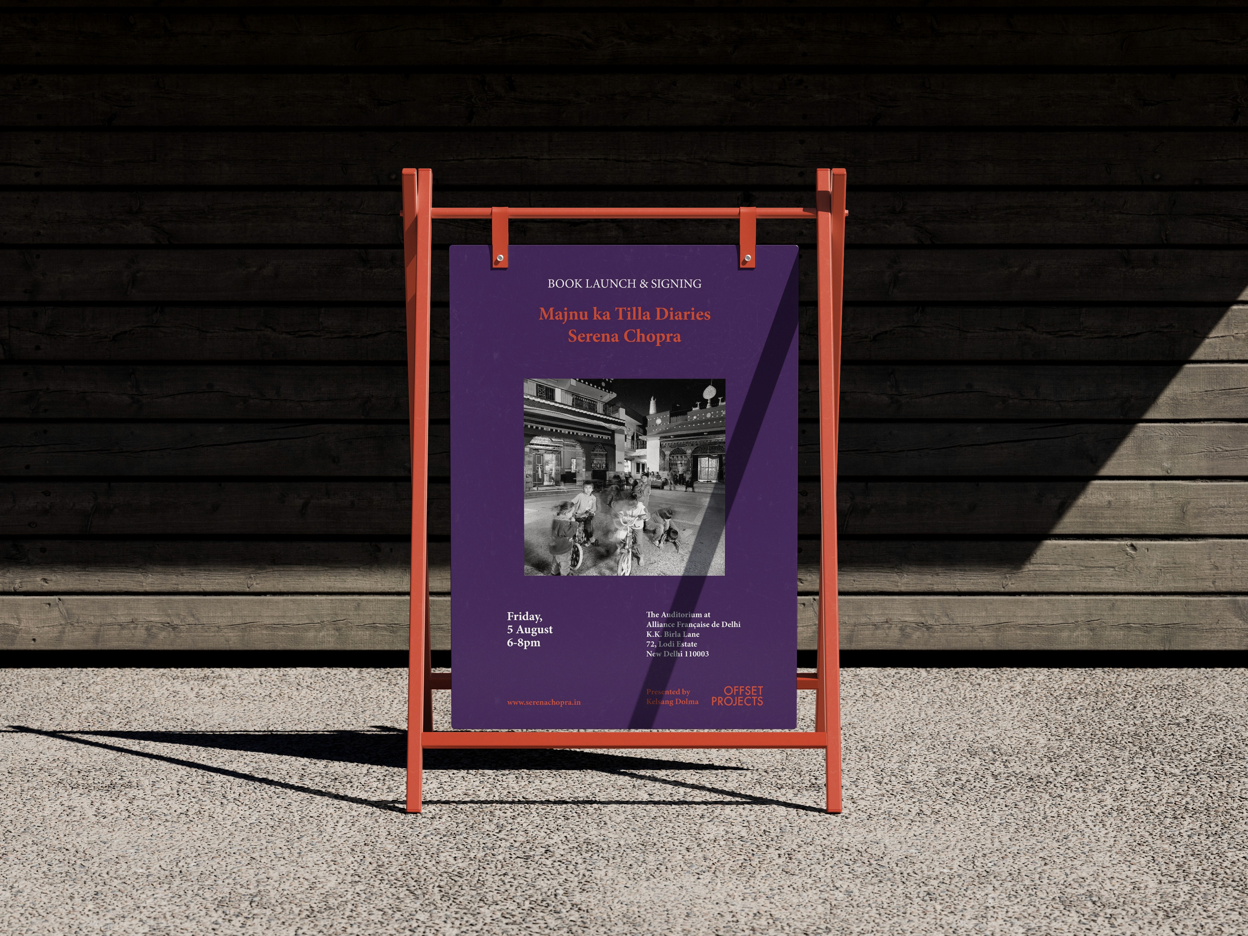
The color palette is sombre yet mirthful and lush reflecting the mood of the painting and can be used in various permutations and combinations - isolations, pairs and sets across applications.
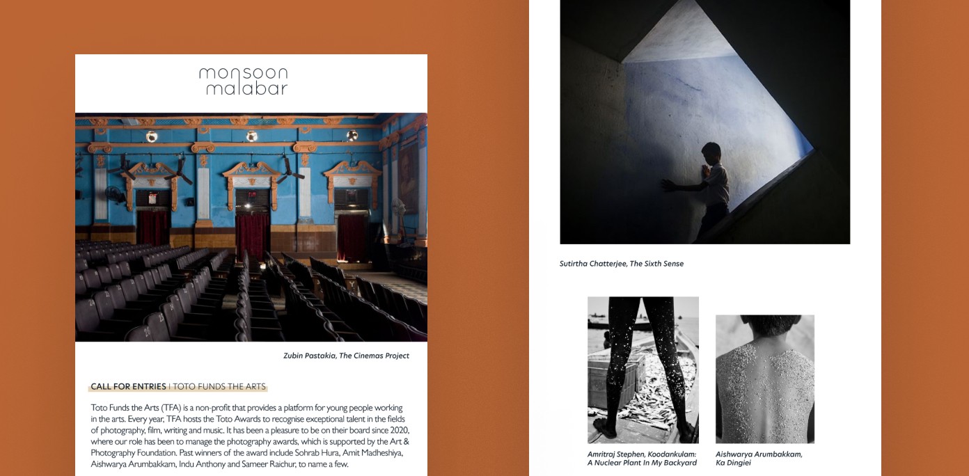
The typography combines a precise typeface for functionality with a humanist sans-serif for warmth and approachability.
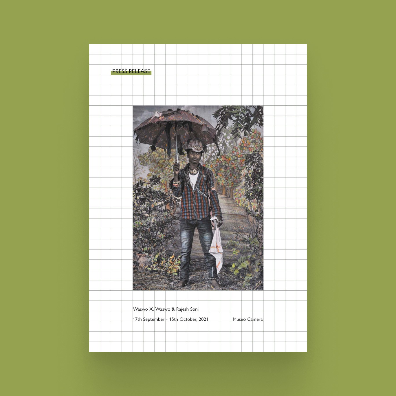
Two-color combination
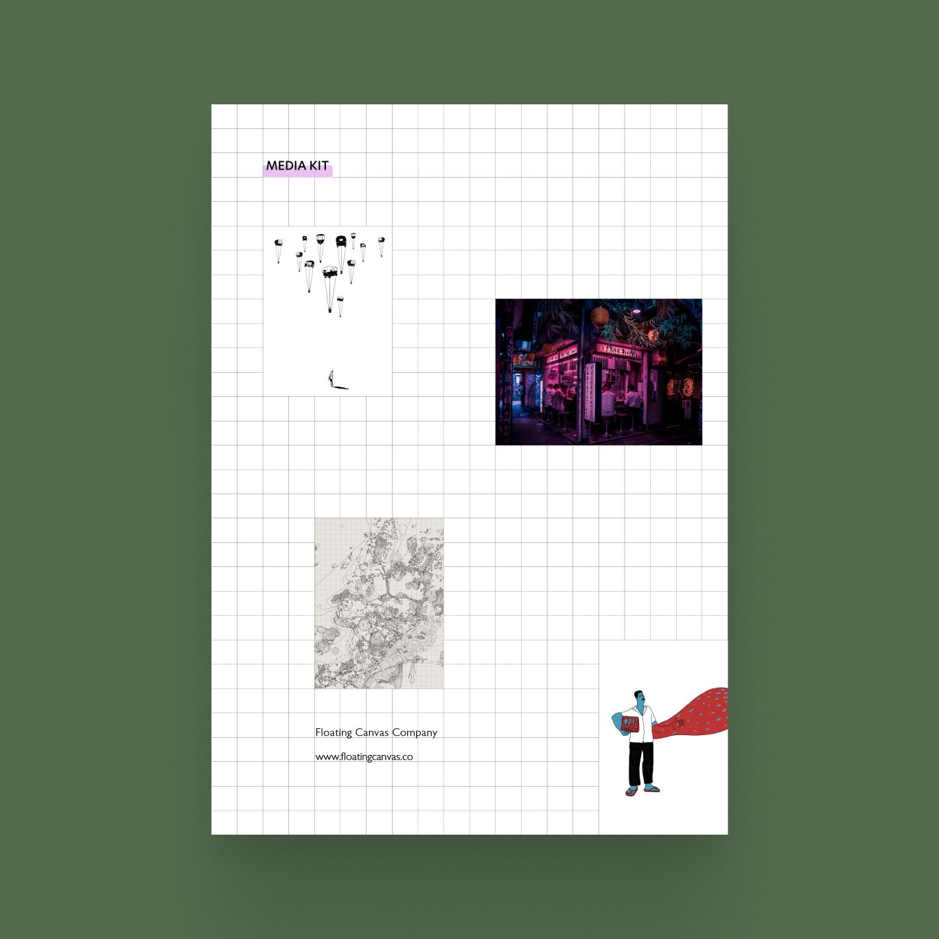
Three-color combinations
